How to build a Google Sheets dashboard people can read
Turn a clean source table into a compact operating view with trustworthy KPIs, filters and charts.
 Written by PhilisPublished July 14, 2026Last updated July 27, 202611 min
Keep raw data on one tab, calculations on another and presentation on the dashboard. Lead with 3–6 KPIs, add only charts that answer specific questions, and make filters or date controls visible.
A dashboard is a decision surface, not a collage of every chart available. A useful one tells the reader what happened, where attention is needed and what to inspect next.
The easiest way to keep it trustworthy is separating source data, calculations and presentation. That prevents a visual edit from breaking the source records.
How to build a Google Sheets dashboard people can read
- 01Name the decisions
Write the two or three questions the dashboard must answer before choosing metrics.
- 02Clean the source table
Use one row per record, explicit dates and numeric entries.
- 03Create calculation blocks
Build small, auditable summaries with SUMIFS, COUNTIFS, QUERY or summary tables.
- 04Choose the KPIs
Use a handful of measures with clear periods and comparison context.
- 05Add focused charts
Show trend, composition or comparison only when the chart makes the answer easier to read.
- 06Create visible controls
Put period, region or owner selectors in a consistent control area.
- 07Test edge cases
Check zero data, missing categories and a new month before sharing.
Separate data, calculations and presentation
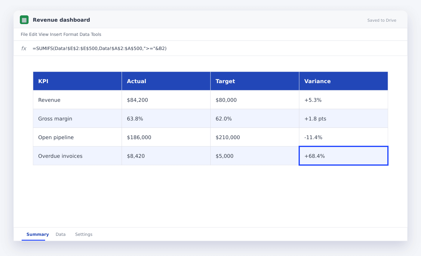
Raw Data should be append-only and rectangular. Calculations should turn that data into the exact KPI and chart ranges. Dashboard should reference those outputs without hiding major logic in presentation cells.
This three-layer model is easier to debug and lets you redesign the dashboard without touching source records.
Give every KPI context
A number for example $84,200 is incomplete. State the period and add a useful comparison: versus target, prior month or prior year.
Use color for exceptions, not for every metric. A neutral KPI that is on track should not compete with an overdue or below-target alert.
Use fewer, better charts
A trend chart, one category comparison and one exception table are often enough. Avoid repeating the same metric as a KPI, pie chart and bar chart.
Place the most necessary chart close to the KPI it explains, and use the same number formats across both.
Questions people ask
Can a Google Sheets dashboard update automatically?+
Yes. Formulas, summary tables and charts update when their source ranges update. External imports may refresh on a delay.
How many charts should a dashboard have?+
Use only the charts needed to answer its decisions. For a compact operating dashboard, two to four is usually enough.
Should I use merged cells?+
Merged cells are acceptable in presentation-only title areas, but avoid them in calculation and source ranges.
More from SheetSteps
How to make a graph in Google Sheets
8 min · Data & charts

How to create a table in Google Sheets
7 min · Getting started

How to sort in Google Sheets without scrambling rows
6 min · Getting started