How to make a graph in Google Sheets
Turn a plain range into the right chart, choose better axes, and avoid the defaults that make spreadsheet graphs hard to read.
 Written by JosephinePublished July 13, 2026Last updated July 27, 20268 min
Select the complete data range, choose Insert → Chart, then use Chart type and Setup in the Chart editor to assign the correct label and entry columns. Use a line chart for movement over time, a bar chart for comparisons, and a scatter chart for relationships.
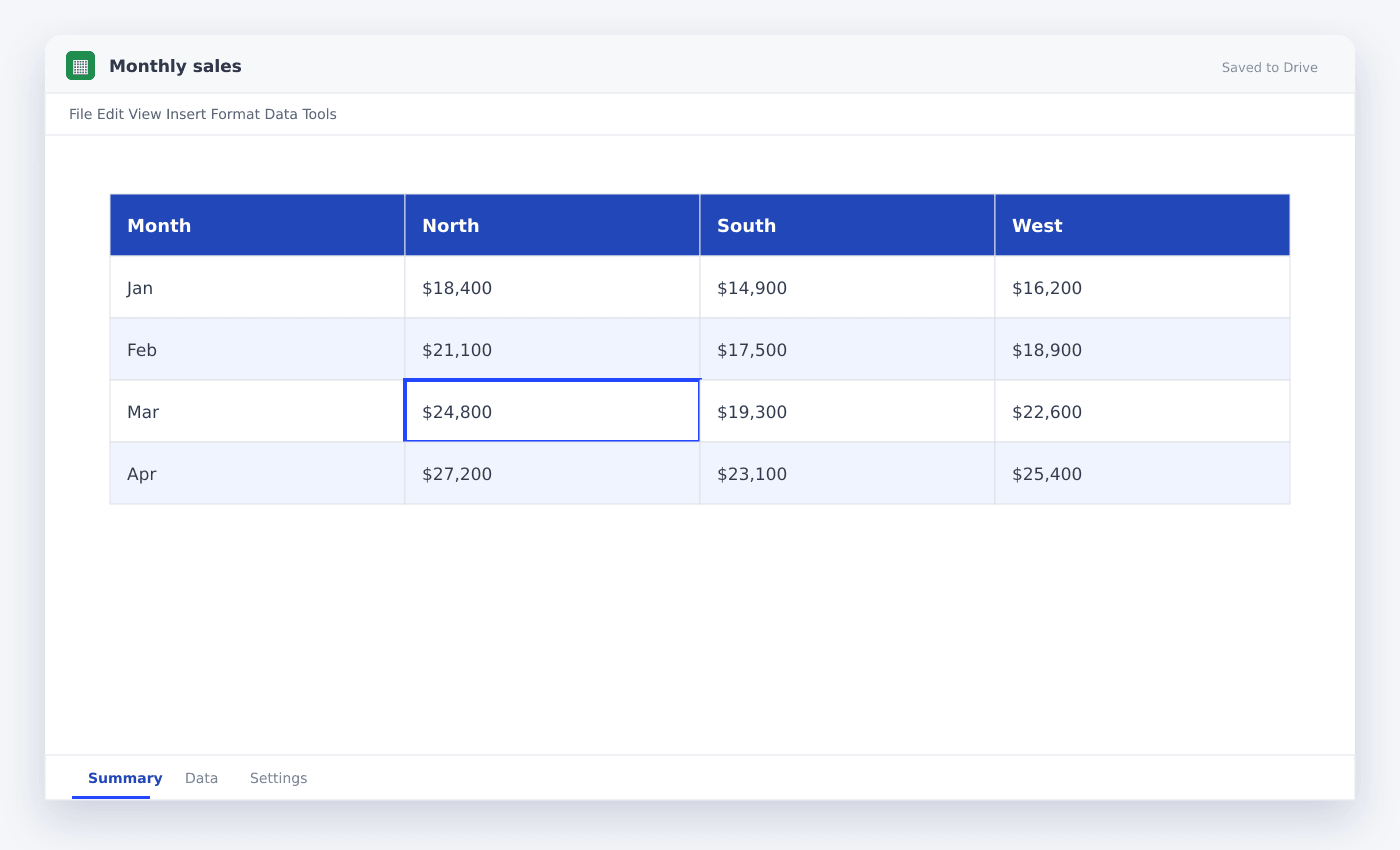
A useful graph begins before you open the Chart editor. Your first column should contain the labels or dates, your remaining columns should contain numbers, and the header row should say what each series means.
Google Sheets can guess a chart from almost any selected range. The trick is making that guess easy to correct. This guide shows the clean path from raw data to a chart you would actually put in a report.
How to make a graph in Google Sheets
- 01Prepare the range
Put labels in the first column, numeric series in the next columns, and one clear header above every column.
- 02Select the full table
Include the header row and every entry you want represented. Avoid totals unless the total is itself a series.
- 03Insert the chart
Choose Insert → Chart. Sheets places a suggested chart over the grid and opens the Chart editor.
- 04Choose the chart type
Pick line for time, column or bar for categories, and scatter for two numeric variables.
- 05Check labels and series
In Setup, confirm that column A is used as labels and each numeric column appears once as a series.
- 06Finish the presentation
Write a specific title, remove unnecessary legend items, and format the vertical axis using the correct number or currency style.
Choose the chart that answers the question
A chart is not decoration. It should make one comparison easier than the table beneath it. If the question is “What changed each month?”, use a line chart. If it is “Which region sold the most?”, use a horizontal bar chart. If it is “Do higher ad budgets produce more leads?”, use a scatter chart.
Pie charts are useful only when the parts add to a valid whole and there are very few categories. For most operating data, bars are easier to compare.
- Time series → line chart
- Category comparison → bar or column chart
- Part-to-whole with 2–5 categories → pie or donut
- Relationship between two measures → scatter chart
Fix a chart that is reading the wrong range
If a chart has missing labels or an unexpected series, open the Chart editor and inspect Data range. A common mistake is selecting one column at a time and forgetting the label column.
For separate ranges, use Add range inside the selector. Keep every series the same length. A 12-month label range paired with an 11-month entry range will produce a misleading chart even when no error appears.
Make the result readable
Use a title that states the measure and period, for example “Monthly revenue, Jan–Jun 2026.” Keep gridlines light, avoid 3D effects, and use one accent color for the series that matters most.
If entries are currency or percentages, format the source cells first. The chart will usually inherit those formats and remain consistent when the data edits.
Questions people ask
Why does Google Sheets show the wrong chart?+
The selected range or inferred data type is usually wrong. Include headers, keep labels in the first column, and choose the chart type manually in Setup.
How do I make a graph update automatically?+
Base it on a range that already includes future rows, or use a bounded expanding range created with FILTER. New entries inside the chart’s range update automatically.
Can I use two vertical axes?+
Yes. In Customize → Series, select a series and assign it to the right axis. Use dual axes sparingly because different scales can exaggerate relationships.
More from SheetSteps

How to create a table in Google Sheets
7 min · Getting started

How to sort in Google Sheets without scrambling rows
6 min · Getting started

How to build a Google Sheets dashboard people can read
11 min · Data & charts